

Without a doubt the highlight of my role as Head Graphic Designer at Nike APA in Hong Kong was designing the graphic tee assortment for Kobe's Uptempo collection. Prior to each season I would receive the global graphic direction from the Nike Basketball design team in Beaverton OR, and from there I would create an extension of that story specifically engineered for the Asia Pacific consumer. When I arrived in Hong Kong in 2005 Kobe had already established himself as a full-on phenomenon in Asia, amassing an especially fanatical following within mainland China.

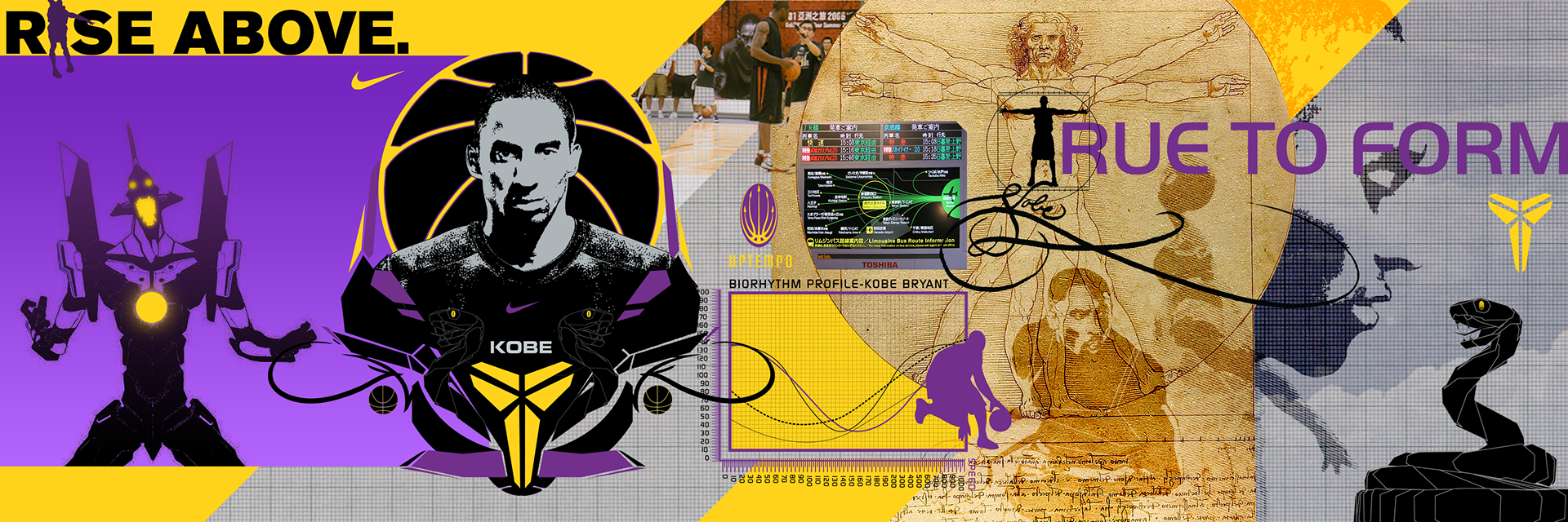
My approach was to translate Kobe's show-stopping style of play into designs that were inspired by youth culture in Asia; drawing inspiration from Anime, video games, Graffiti, traditional Chinese and Japanese printmaking, and of course the vibrant and energetic youth basketball culture that had swept the Eastern hemisphere. Being that I had already drawn influence from these sources for years before working for Nike this was a natural fit for me, and the end results were some of my favorite designs to date.
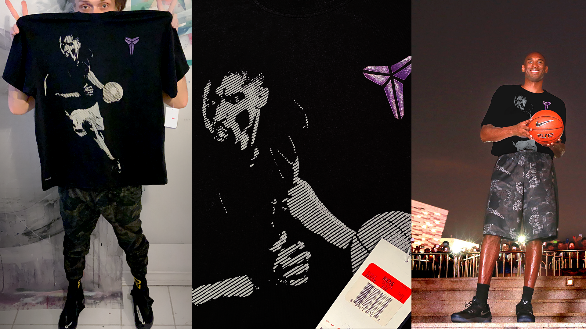
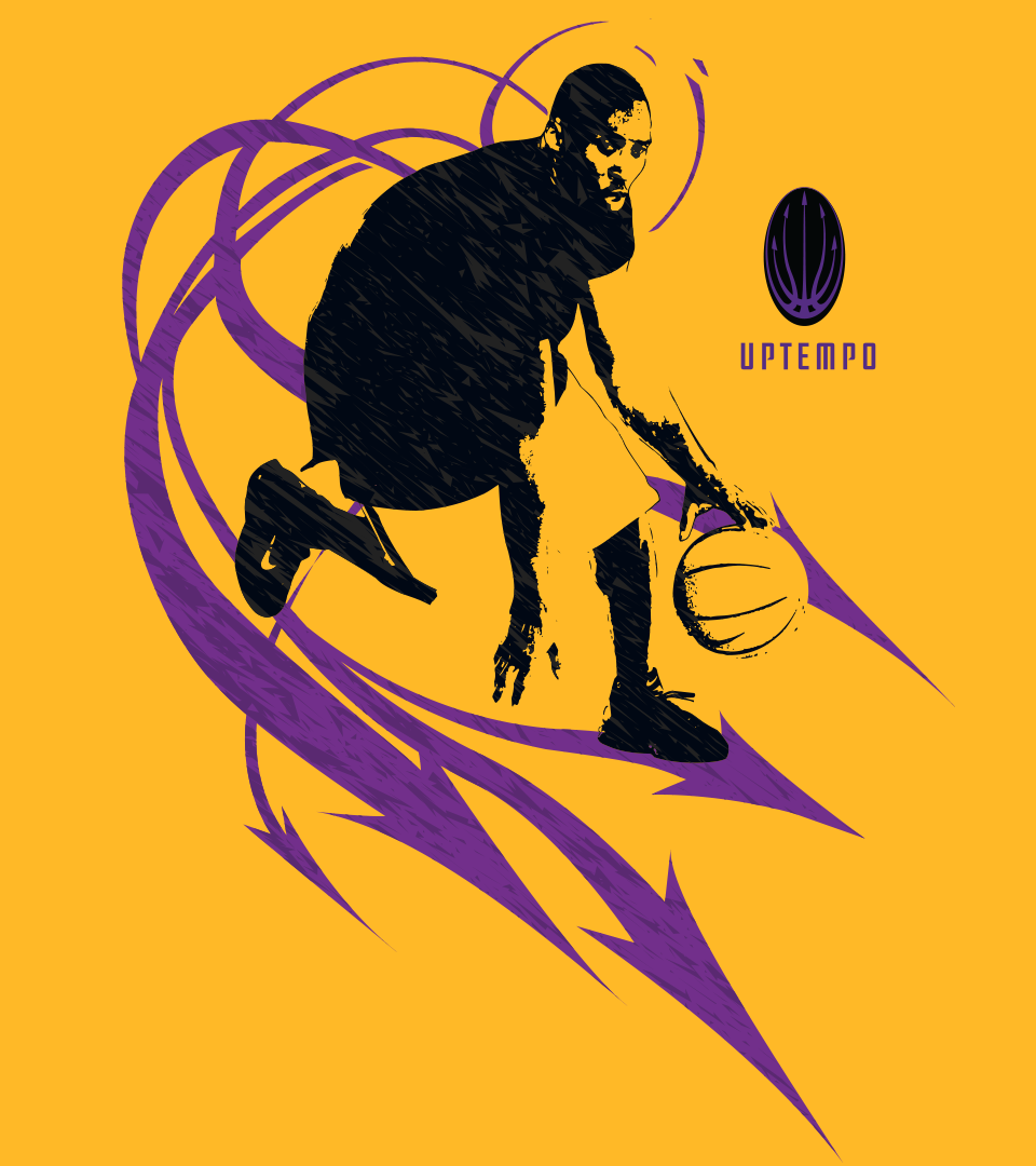
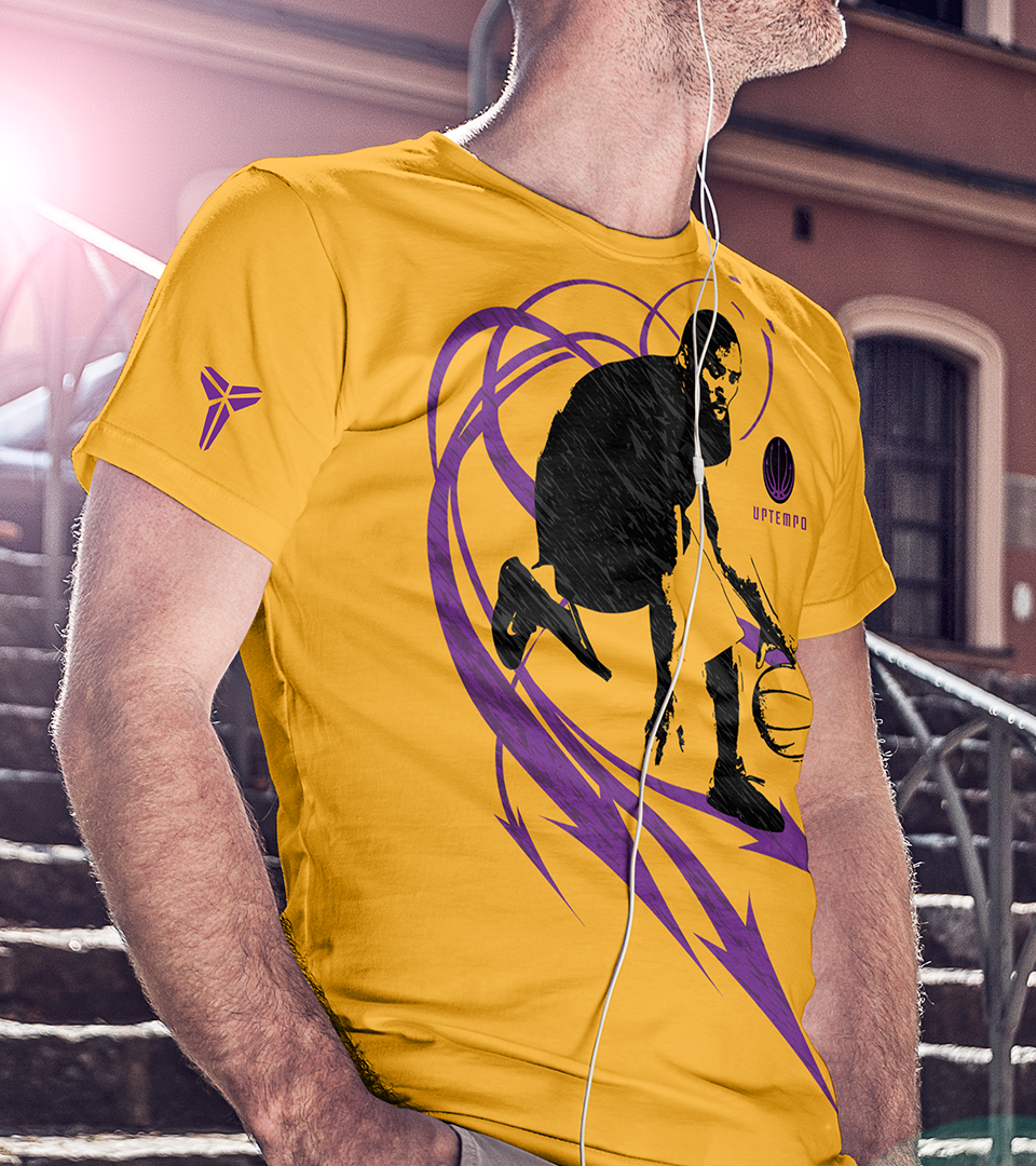
"Crossover" (pictured left) was the very first design I created for the Uptempo collection. My goal was to put a subtle technological spin on the classic hero tee and create a design with Kobe's signature stance. The approach was to feature graphic as large as possible, but it was also crucial to keep the design breathable so that you could actually hoop in it and not get weighed down by a large area of solid ink. My solution was to break down the illustration into a linear format, with the spaces between the printed lines allowing heat and moisture to escape.
When "Crossover" hit the market about a year later I immediately ran to the Nike Flagship Store in Tsim Sha Tsui and purchased one. I intentionally bought a size too big for me so I wouldn't be tempted to wear it. It has since remained the most valued tee in my personal collection, and I keep it as a reminder of a major turning point in my design career. Now that Kobe has since passed, it has taken on a new meaning that I had never anticipated and I feel extraordinarily fortunate to have been granted the opportunity to work with such a legendary icon.

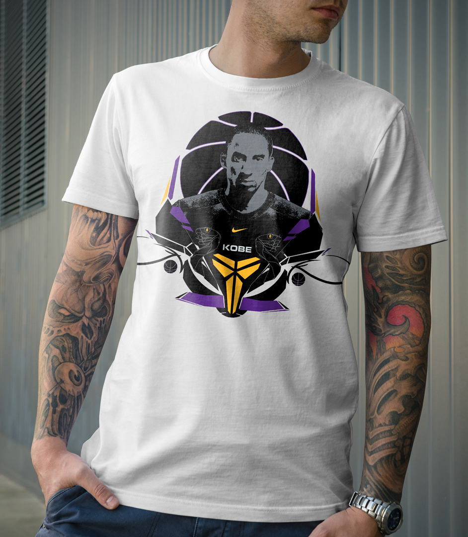
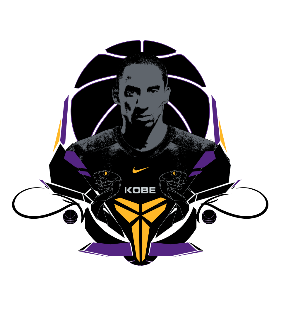
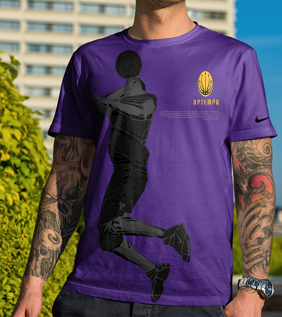
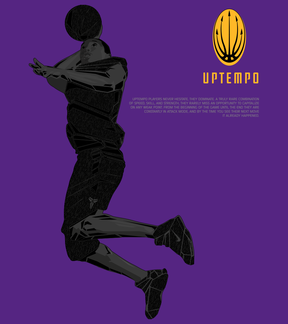
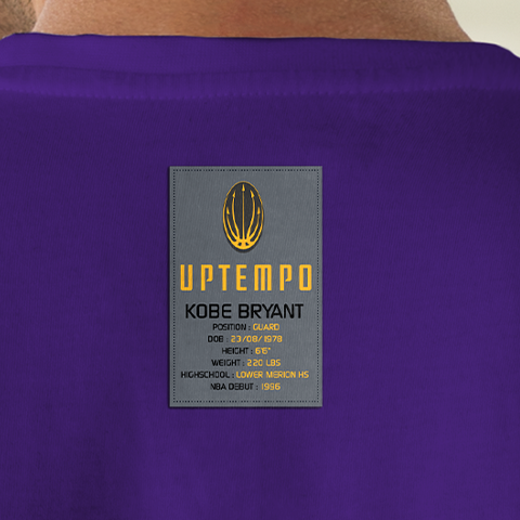
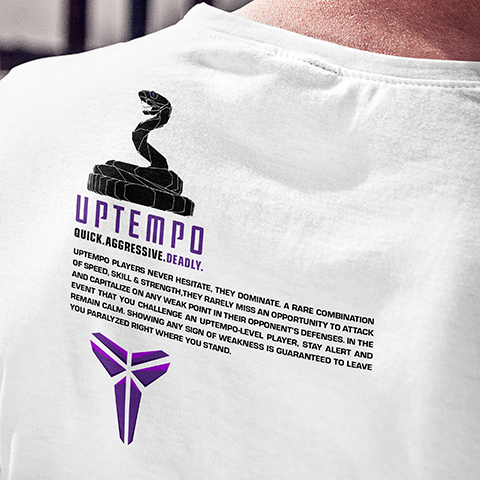
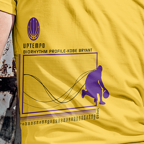
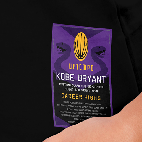
As the Uptempo collection gained traction I began branching out from the original photo-based formula of "Crossover" and began introducing technical illustrated details based around Kobe's "Sheath" logo (R). This logo crystallized Kobe's style of play perfectly, representing his technically clean and precise attacking style in a bold elegant way. I began creating graphic elements and typefaces that embodied these qualities and using them to enhance Kobe's photographic images, careful to not clutter the layouts and draw attention away from Kobe's likeness. The end results are the selected graphics below which represent a range of the key styles that made this collection come together into a cohesive graphic story.
I never had the privilege of meeting Kobe, but from what I was told he would personally review and sign off on the graphics I created for him. Given his stature and the standard of excellence he represented I really went above and beyond to ensure everything I designed was of the absolute highest level of quality and originality. The resulting body of work represents a unique moment in time within my design career, and I'll remain forever grateful for such a rare opportunity to create designs for a truly legendary talent.